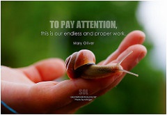
The concept of mindfulness is about awareness. This is particularly pertinent as we search for a means to stabilize every one of our tasks, decrease tension as well as enhance the level of happiness in our lives. Being mindful likewise consists of the steps we take to optimize our feelings of satisfaction. This is represented in the home by exercising simplification, curation as well as utilizing color to improve our living spaces. The expression ‘living in the moment’ is reflective of the mindfulness and sense of balance we seek to incorporate into our lives. Mindfulness is a technique intended to raise our awareness of daily contentment with our experiences. Blocking the stressors and eliminating distractions is accomplished through applying simplification, and expressed with use of color that ultimately improves the feel of your living spaces.
In 2017, an Engineered Nature scheme was forecasted, where natural tones operate in harmony with scientifically manipulated synthetic greens. As we get into 2018, we are seeing tones of green in design broaden past what was anticipated.
When you decide to change the look of your home, you have many options, from changing out pillows to updating your light fixtures, the many possibilities can leave you wondering where to start. The good news is, the indoor color trends for 2018 are here to help.
While Pantone chose Ultra Violet for their choice of paint of the year, PPG (a worldwide vendor of paints) and also popular paint brand names Olympic and Glidden have all revealed tones of black as their choice for shade of the year in 2018. PPG's Black Fire is referred to as an "unprecedented, statement-making black with deep tones of indigo." Olympic's Black Magic is more saturated and charcoal, is similar, referred to as the "perfect mix of masculine and feminine." Glidden identifies their shade of the year as Deep Onyx, as "Similar to a little black dress... a timeless, classic staple."
Color enthusiasts celebrate-- 2018 is most likely to be an amazing year! With a lot of fresh and vibrant palettes and also the development of old favorites, this year's trends are comprehensive, accommodating every taste. Whether you're in design, like to do it yourself, or looking at guest room color swatches, be adventurous and express yourself with color!
Develop maximum impact through color accents; use bright colors in small spaces or dark colors for formal spaces. On the outside of your home, use accents to highlight architectural details, front doors and windows for example.
No matter the theme, beach or rustic farmhouse, light blue is a good match. Paired with whites and neutrals with green accents will make the space feel fresher and enhance the overall comfort level of any space.
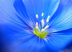
Bold, Bright Blues: While we will be seeing many neutrals in coming seasons, don’t believe that even more impressive shades will not be sprucing up houses as well. Everything from sapphire to cobalt to vivid Parisian blue is strongly improving rooms of all kinds. Use it a little or a lot, rest assured you’ll recognize the improvement.
Lavender: this shade will be prevalent the entire summertime season. Charming yet sophisticated, you can use the shade to spice up bedrooms or sitting rooms successfully.
Sunlight Yellow to Gilded Goldenrod: These colors will brighten any room and uplift the feel. Try pairing it with black to make a defining statement.
Blue-Green: More sophisticated than brighter hues, this shade will infuse homes with calm, grounded vibes. Perfect for bedrooms, but will enhance any space.
Milk white: This warm hue is an alternative to the common white, offering a fuller color contrast.
Spruce Blue: BEHR has chosen this shade of blue as their color of the year for 2018. Inspired by nature, this cool, tranquil color is soothing and creates a restorative feel. A combination of blue, gray and green, this color evokes a sanctuary environment to create a relaxing space where you can recharge and be present.
The overall theme for 2018 is “In the Moment” and is represented by the relaxing hues favored to develop a mindful approach to daily life. The palette is versatile and lends itself to a variety of moods and tastes, applicable to multiple home styles.
Feel free to experiment and exercise your imagination! You’ll find endless options and inspiration at your local home improvement store.
---------------------------------------------------
ABOUT FANTASTIC FINISHES PAINT CO.
Our contractors are fully bonded and insured with
the expertise to perform whatever task you may
require, efficiently and with customer satisfaction
as their first priority.
Contact us today for a free estimate! (972) 672-2512
Web Design, Hosting, and Online Marketing Provided By 2Surge Marketing