Before you pick up a paint brush, carefully consider the impact color has on mood. The psychology of color may help you define what the appropriate color is for the spaces you plan to paint.
Some prefer their walls to appear soft and subtly colored, however they may still want to experiment with bolder colors as accents. Light colors can be made more lively when the colors compliment each other. When the space being painted is small, then light colors overall would probably work best as it will give the room an airy, lighter look that will provide an illusion of spaciousness.
Light colors also offer more versatility with home decorating as well, as bold colored furnishings, paintings, and photo frames, for instance, will pop against the lighter hues. The lighter colored walls will require more maintenance to keep them bright and clean, but well worth the effort if that is your choice.
Light or dark, your color scheme will define your home and create a mood representing your personality.
Orange has been trending for years, and is considered a color that will maintain its popularity for many more. Not surprising really, orange is a warm color that is inviting, invigorating, energetic, dynamic, and versatile. Use it in living rooms or family rooms to enjoy the friendly and welcoming atmosphere it will create.
Reds are bold and has a tendency to raise blood pressure, heartbeat and energy, but is also one that enhances intimacy and passion. Also understood to raise the appetite, you’ll find it used in restaurants. Consider it for your formal dining room or bedroom.
Greens come in a wide variety of shades, from light to dark, and while it’s not for everyone, the choices are seemingly endless if your headed in this direction. Appropriate for any room in the house, you’ll find whatever shades of green you use, they will stand out. It’s a calming, relaxing color; the lighter shades ideal for bedrooms and living rooms, mid tones good for kitchens and dining rooms.
Blue, a cooler color, is also calming and promotes tranquility, making it ideal for bedrooms. The color is an appetite suppressant, so not used much for dining rooms.
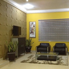
Yellow projects the feeling of sunshine, flowers, and cheerfulness, and is easily combined with multiple hues. Even on it’s own it makes a great impression. Combine it with orange, beige, or lighter shades of red, and create a signature look. Yellow is warm and welcoming; a good color for dim entryways or hallways.
Violet is tricky. Many adults aren’t fond of the purple family, while they respond favorably to the rose hue family. It can be used in dining rooms, bedrooms, or libraries to achieve an attractive result. Children, however, seem to enjoy violet, so you’ll find it works well in children’s bedrooms and playrooms.
It’s cousin, lavender is described as a lighter version of purple, and is associated with royalty. It can transform a room to reflect whimsy or elegance in its versatility. Used most commonly in bedrooms and balconies, it offers a unique touch to any space.
The many faces of pink offer variations for use in many spaces. Lavender pink reflects an inventive personality. Using this empowering purple-pink color will invite warm, exciting conversations; perfect for dining or living rooms where you welcome guests.
Hot pink reflects excitement and encourages adventurous conversation and situations. This magenta shade will make you and your guests less sceptic and more enthusiastic. Go from dull to exciting! Think party room!
Simple color schemes favor one color as the canvas with accents of stronger colors, creating contrast and drama, reflecting intense self-assurance.
Color schemes using variations of black, white, and grey are often used, providing clean lines and sharp contrasts against stronger feature colors. Purple is often considered a strong canvas choice. Blues vary from ice blue to blue-blacks, cool and delineating. They reflect onto the green palette with strong aquas.
There are a number of color personality quizzes online if you would like to experiment with their definitions of your preferences. Have a bit of fun and enjoy creating your perfect space!
These ideas should give you a starting point as you search for your perfect palette. Color choice is a personal matter and you’ll have to live with it, so choose carefully. Finally, once you’ve identified your palette, be sure to invest in a top quality paint.
---------------------------------------------------
ABOUT FANTASTIC FINISHES PAINT CO.
Our contractors are fully bonded and insured with
the expertise to perform whatever task you may
require, efficiently and with customer satisfaction
as their first priority.
Contact us today for a free estimate! (972) 672-2512
Web Design, Hosting, and Online Marketing Provided By 2Surge Marketing