Have you ever ended up refurbishing a space in your home only to see that the color does not sync well with the rest of your house?
Whether you have an open floor plan or separate spaces, selecting a home color scheme can produce a harmonious space that interacts well.
The most effective means to develop a beautiful palette for your home is to consult closely with your painting contractor. They have training and resources to create a lovely scheme that will compliment your existing colors, or even help create a whole new look if that’s your desire. If you’re accomplishing this on your own however, here are pointers to ensure you produce unified color in your house:
Selecting a beginning color can appear intimidating, it does not have to feel that way. You may find that a color from your friend's house, that looked great on their walls, might look horrible in your house. The reason is two-fold: the beginning base and lighting.
Paint colors should be picked in the home under natural light so you are able see how it in fact appears at various times of the day. (Based on the undertones, it will reflect various hues at different times and you need to enjoy them all).
To develop a predominant color to begin with, observe the colors of things existing in your home that are "fixed" or unchanging, such as flooring, tile, cabinets, and so on. You might want to follow current trends and decide to paint your home grey, except your flooring is brown. If you select the very same grey paint your friend down the street utilized (however, they happened to have concrete colored tile floor covering) you will question why it does not look the very same.
This does not indicate that you’re unable to use grey paint, just that you merely need to opt for a grey paint with a warm or beige undertone instead of a cool blue undertone.
Don't stress, if this is making you think about throwing yourself into traffic, that's why in-home color assessments are recommended... we really want to prevent the unpleasant things.
For the overall scheme of your house, limit your choices to no greater than 2 colors, plus trim.
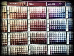
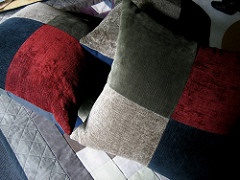
Find palette colors for your home that you will love residing in. You can identify a color scheme you like by searching in a magazine, matching or complimenting shades from a pillow, art piece, rug, or use pre-designed color combinations readily found where you purchase paint.
It can be handy to begin with a mood or style you want to communicate in your house, like a modern/metro or beach motif. Discover a piece to inspire you or a picture that catches that feeling and note what colors are involved.
Bedrooms must reflect your personality; this is a personal sanctuary and these areas represent you differently than the remainder of the home. Many would rather see the room schemes complimenting each other when doors are open, accomplished by using colors from the exact same family of undertones.
Please, don't go running for traffic again ... keep in mind it's still just paint!
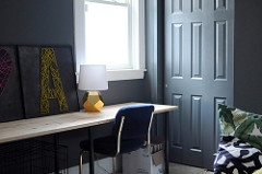
If you are using a shade of grey for instance, you might pick the dark grey for the living room, and a softer shade of that grey for the kitchen area. Observe where and how the light changes during the day and into night on the walls throughout your home. These are the locations that will offer you natural color variations from the colors being utilized as light will play differently with these areas. This is why we should not use more than 2 colors throughout the predominant areas, particularly if there is a great deal of architectural detail; it simply becomes too busy and you will lose the flow.
If you pick red for the accent wall in the family space, consider using ornamental plates in the kitchen area that have that same color of red, connecting the spaces together. Then, utilize that exact same red in decorative accents for the formal living space, in pillows, the material for the drapes, or vases.
Even if you have separate rooms rather than an open floor plan, if you can look from one room and see to the other, it is very important to pick colors that develop consistency in between the 2 spaces. Some prefer to finding accent colors in artwork found in the home. Choose 2 accent colors: one major and one minor so that you’re operating in 3's.
This is the area for your visitors can be "glammed" up with pretty crystal light fixtures, deeper toned colors, or better yet, spectacular, shimmery wall covering.
Keep in mind to follow the same rules for choosing the colors from the floor covering etc. similar to paint.
All whites are not created equally. There are cool and warm whites. Choose a white with the ideal undertones to work with your color palette.
Say farewell to boring, all white walls. Bring heat into your home, be it with color, mid-tone neutrals or cool whites with exotic color accents!
These easy style tips will assist you in attaining a well balanced, unified appearance you’ll enjoy! Have a good time developing a sense of continuity and harmony with a color strategy throughout your house.
---------------------------------------------------
ABOUT FANTASTIC FINISHES PAINT CO.
Our contractors are fully bonded and insured with
the expertise to perform whatever task you may
require, efficiently and with customer satisfaction
as their first priority.
Contact us today for a free estimate! (972) 672-2512
Web Design, Hosting, and Online Marketing Provided By 2Surge Marketing